
SVG images with Power BI Native Visual
Understating how to use SVG images in Power BI with an example.
Admin
9/8/20243 min read
Recently we wrapped a project on the Training and Development dashboard with a client. They had a custom application for managing training programs, we used a API to connect the data source.
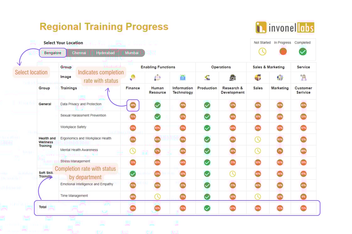
One of the visuals was to graphically represent the completion status of training for each sub-function, by training groups and region. We had three statuses "Not Started", "In Progress" and "Completed". The most exciting part of the visual was to show the percentage of employees who are yet to complete the training with status icon for each training and department in grand column total when status is "In Progress".
In Power BI, the native matrix visual does not support the simultaneous display of images and numbers in the value field. It only allows either image format or numeric data. To overcome this limitation, we used SVG (Scalable Vector Graphics) images, which allowed us to create custom icons that could display numbers inside them.
The expected outcome of the visual is as show below.
What are SVG images?
SVG is a vector graphic format that uses XML to define images. Unlike raster images (like JPEG or PNG), SVG graphics are resolution-independent, meaning they can scale to any size without losing quality. This makes SVG ideal for creating sharp and clear visuals at any zoom level.
How does it work?
Custom Icons: SVG allows you to create icons customized to your needs. For example, you can design icons with embedded text like numbers or labels to visually represent data within Power BI.
Dynamic Visuals: SVG enables you to create visuals that change based on data. For instance, SVGs can be updated dynamically through DAX measures to reflect various statuses or values, such as progress bars or status indicators.
Enhanced Customization: SVGs offer greater design flexibility compared to standard image formats. You can style SVGs using CSS, apply transformations, and include interactive elements, making them highly customizable for your reporting needs.
Our Approach
By leveraging advanced DAX (Data Analysis Expressions) techniques, we can dynamically switch between different icons based on the data. Additionally, we can apply these DAX formulas to ensure that the icons and numbers display correctly even in the total columns of the matrix visual.
Limitations of Native Matrix Visual in Power BI:
The default matrix visual in Power BI allows you to add values either as numbers (such as sum, average, and count) or as images (using conditional formatting with image URLs). However, it does not support the display of both types together in a single cell.
Using SVG for Icon and Number Combination:
SVG is a vector image format that supports XML-based text rendering. In Power BI, SVG can be used within a measure to render both an icon and a number in the same visual space.
By creating a DAX measure that outputs an SVG image as text, you can design custom icons that include numbers or any other dynamic text.
Creating Dynamic Icons with DAX:
We can write DAX expressions that generate SVG markup strings based on the data context. These strings are then interpreted by Power BI to render them as images.
The DAX logic can include conditions to switch icons based on the values, enabling a dynamic, data-driven visual experience. For instance, an upward arrow icon might be shown when values increase, while a downward arrow might indicate a decrease, with the corresponding number overlaid on the icon.
Handling Grand Totals and Subtotals:
In Power BI, grand totals and subtotals require special handling because they aggregate multiple values. The advanced DAX can be written to distinguish between regular data rows and totals, providing appropriate SVG icons or text for each scenario.
By using DAX functions like ISINSCOPE or HASONEVALUE, you can differentiate between row levels and apply different SVG logic, ensuring that icons and numbers display correctly even for aggregated values.
This approach allows for more visually informative reports where data can be represented not just with numbers but with intuitive graphical elements directly within the matrix visual.
Click here to access visual in Power BI service.
Disclaimer
The data and information presented in this illustration are entirely simulated and do not represent real data or insights related to any specific company or organization. These figures are provided solely for illustrative and indicative purposes and should not be considered reflective of actual business performance, strategies, or outcomes.
+91-8123616466

Links
Shivamogga | Karnataka | India