
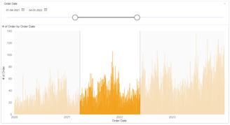
Highlighting a selected period range in a bar chart with shaded areas
With the latest May 24 Power BI updates, we now have more formatting options available for highlighting areas in different colors and adjusting transparency. I utilized these options to create a highlighted area chart, making the remaining areas lightly transparent.
POWER BI VISUALIZATION
Invonel Labs - Admin
6/2/20242 min read

Data and Model
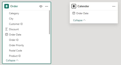
For the exercise, we are using sales data with order date and order ID as the count. To manage the date range, I have duplicated the same data and created another table with only the date.
In the model,we have not established any relationships to ensure the data is not filtered.
Create Bar Chart
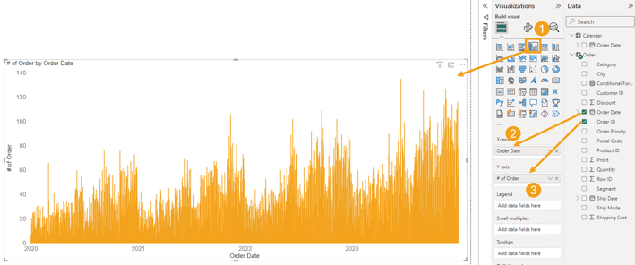
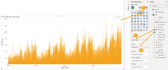
Create bar chart with X axis Order date and Y axis order id count.
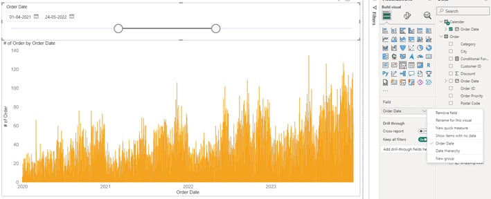
Create Date Slicer
Select the slicer and add the date from the calendar table. Change the date hierarchy to display the date.
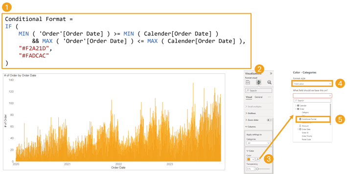
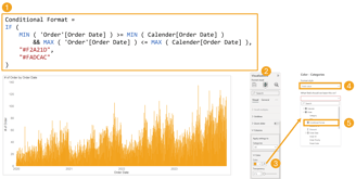
Add Conditional Format
To differentiate the bar colors with light and dark shades, we will create conditional formatting based on the minimum and maximum dates from the calendar date.
Create DAX measure to do the conditional format.
Select the bar chart and go to format option.
Under column option -> color option select function icon.
Once you get conditional format window select the format style as Filed Value, under what filed selection pick the measure "Conditional Format".
Start and End Range Highlighter
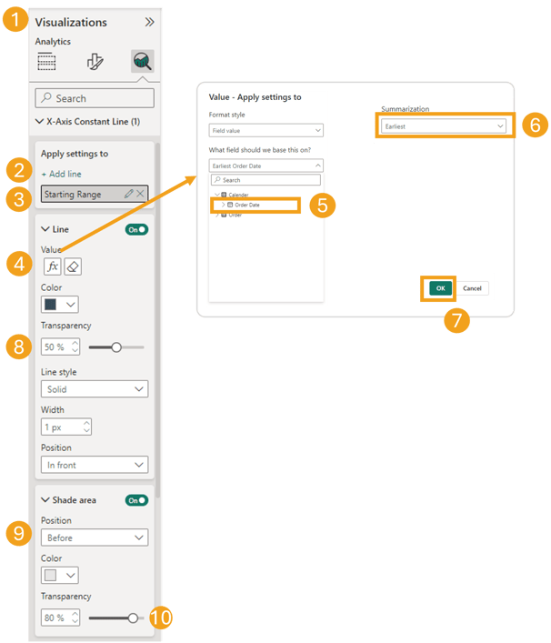
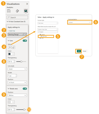
To highlight the beginning area in the chart we can use "Add further analysis to your visual" and do the below steps.
Add X Axis constant line as "Starting Range".
Select function icon it will give value apply setting where select the calendar date column.
Under summarization section select Earliest.
Under line section - Make the line transparency to 50%, Lie style Solid with 1px width.
Add shade area-> Position = Before, Color = Light Gray and Transparency = 80%
Start Range Highlighter
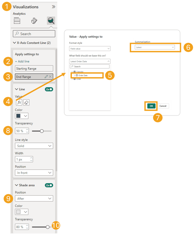

End Range Highlighter
To highlight the after area in the chart we can use "Add further analysis to your visual" and do the below steps.
Add X Axis constant line as "Ending Range".
Select function icon it will give value apply setting where select the calendar date column.
Under summarization section select Latest.
Under line section - Make the line transparency to 50%, Lie style Solid with 1px width.
Add shade area-> Position = Before, Color = Light Gray and Transparency = 80%
+91-8123616466

Links
Shivamogga | Karnataka | India